Creating a new parent brand for a non-profit organization

Sarah’s Home had an organizational challenge. What began as a single program was rapidly expanding into multiple standalone programs, creating confusion around the brand itself. Was Sarah’s Home the organization, or simply one program within it? Partnering with Never Settle, we helped define a clearer structure, creating a parent brand that could unify the growing organization while giving each individual program its own distinct place within it.

Problem

Sarah’s Home began as a single program, but as the organization expanded and new programs were introduced, its role became increasingly unclear. The Sarah’s Home website had also begun featuring these additional programs, making it difficult for users to understand what Sarah’s Home was.

Solution

The solution was to create a new parent brand that would act as the primary organization, with programs such as Sarah’s Home sitting beneath it. This new structure would eliminate existing confusion while giving the organization the flexibility to continue adding and growing programs in the future.

Value Delivered

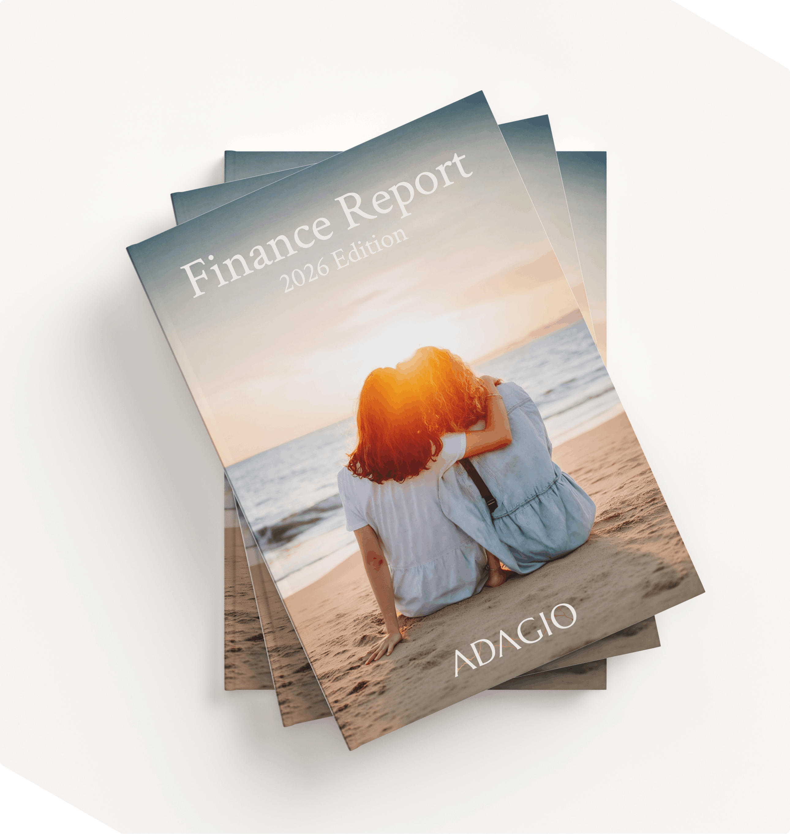
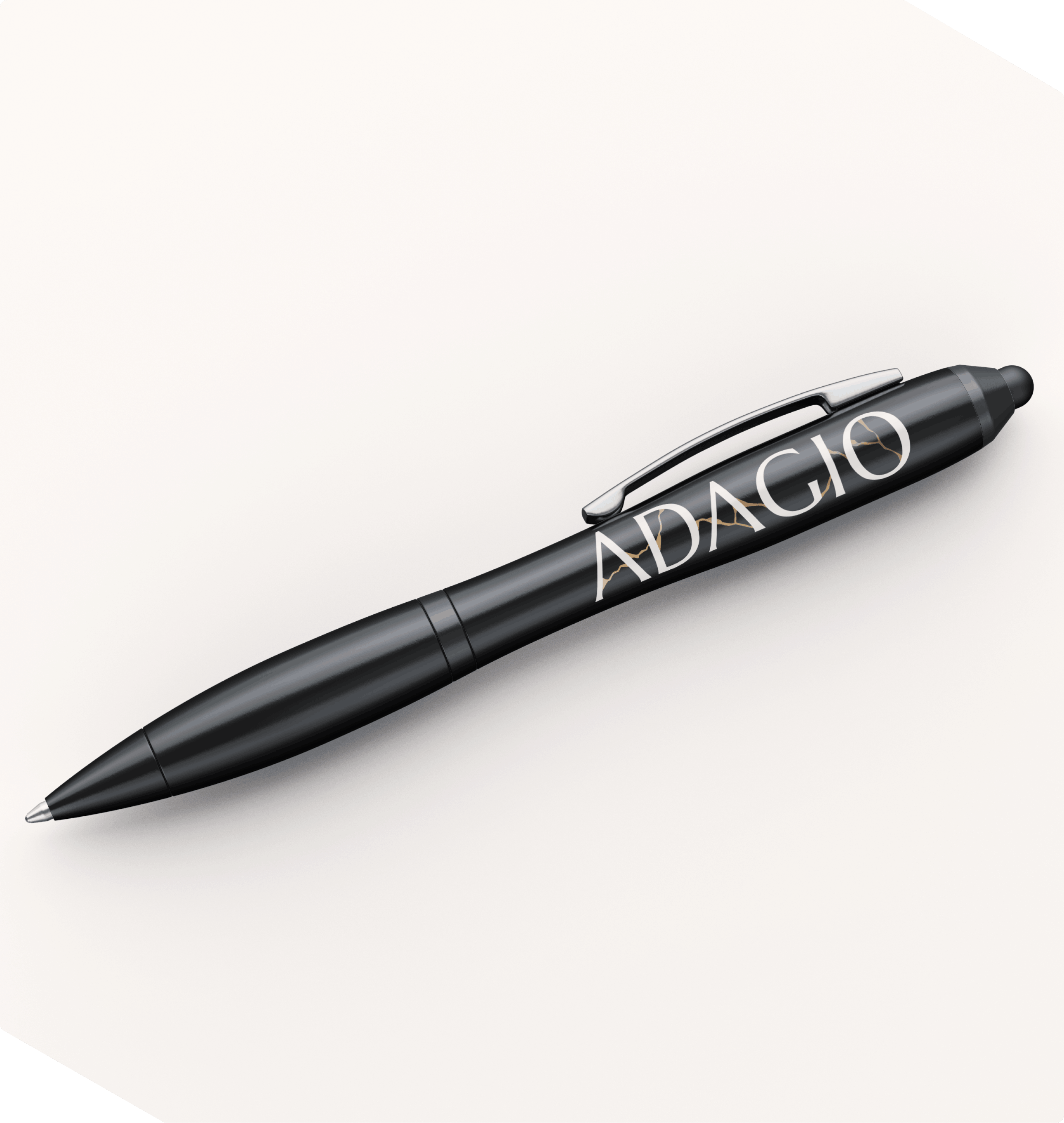
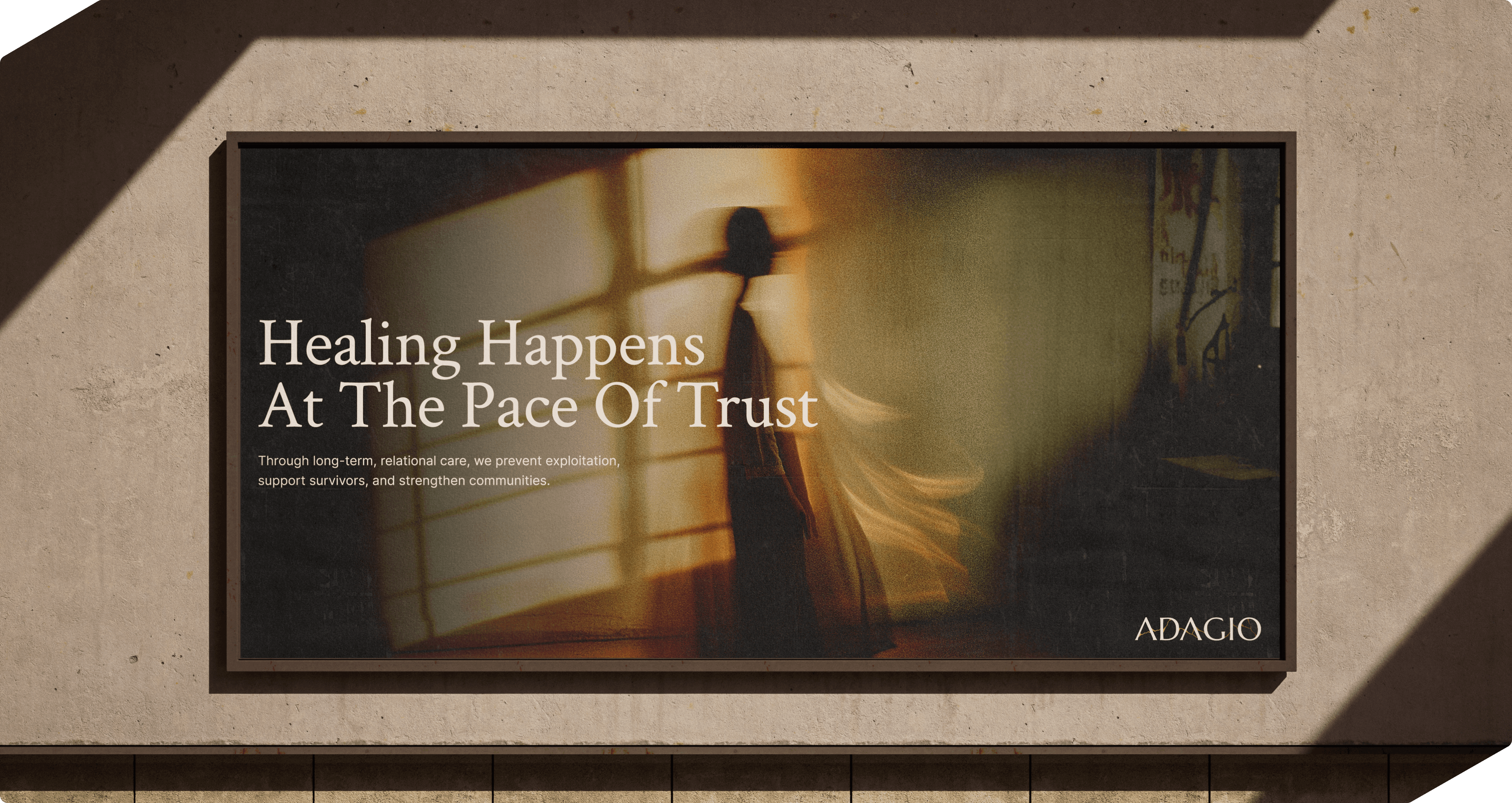
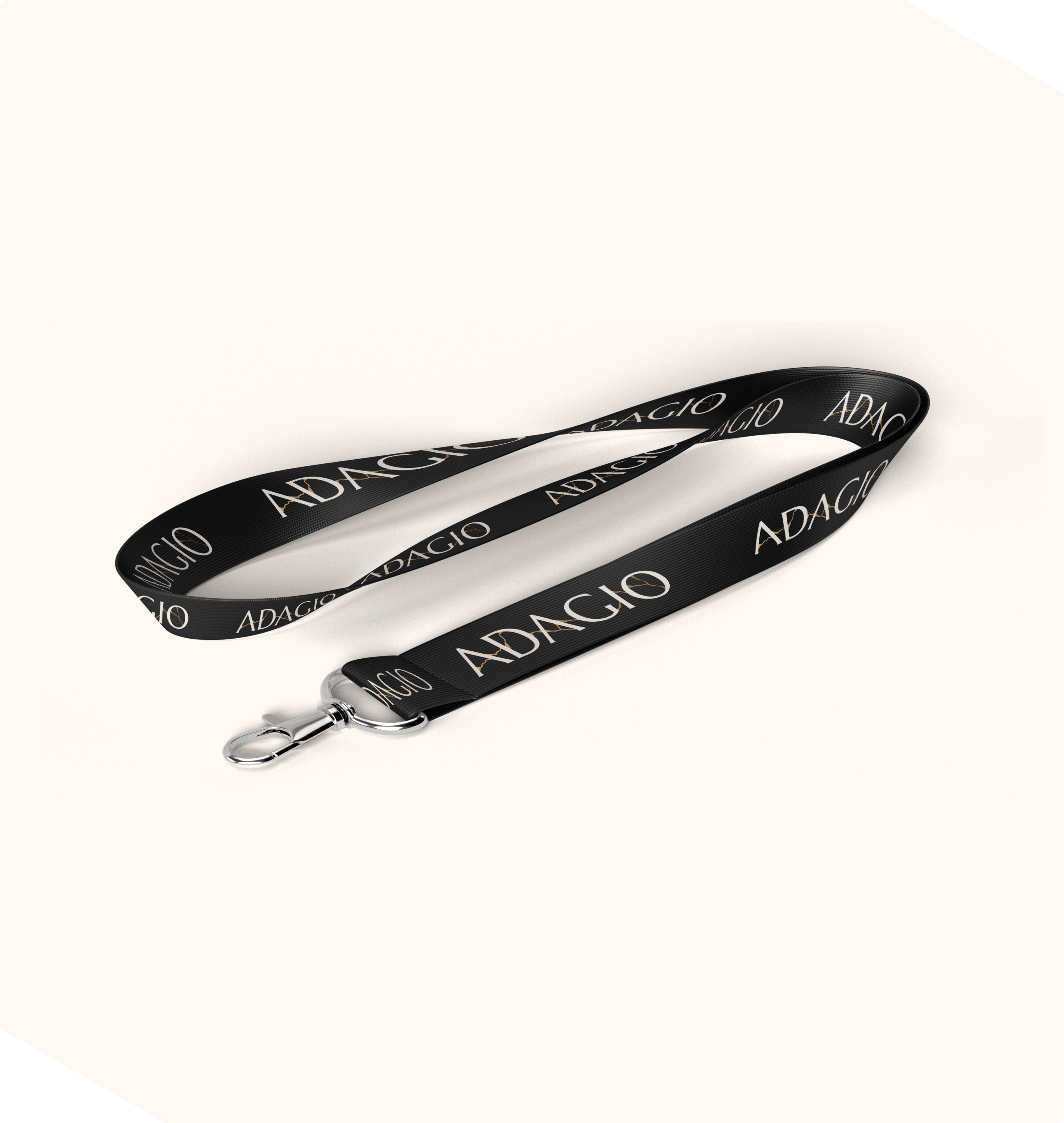
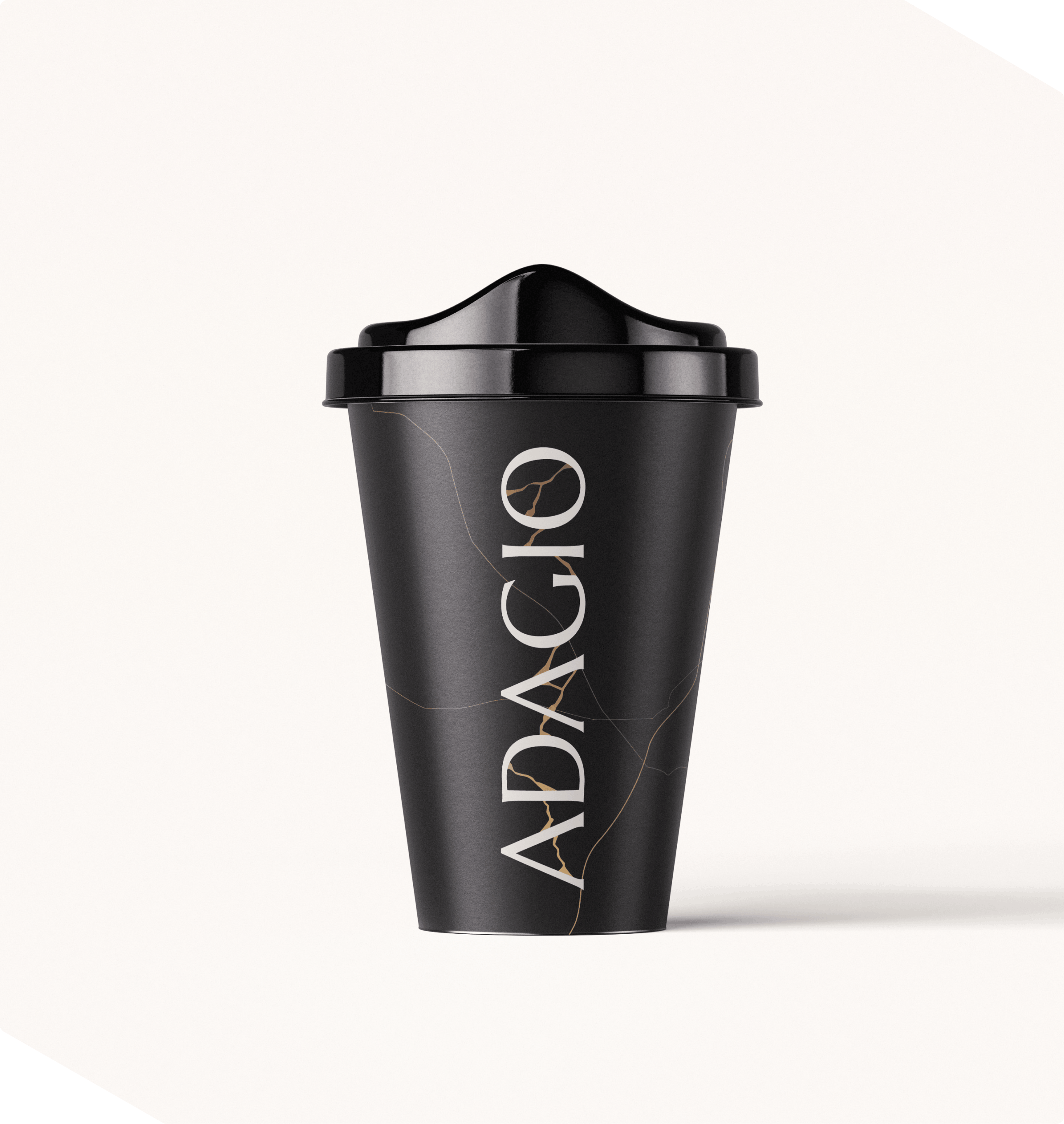
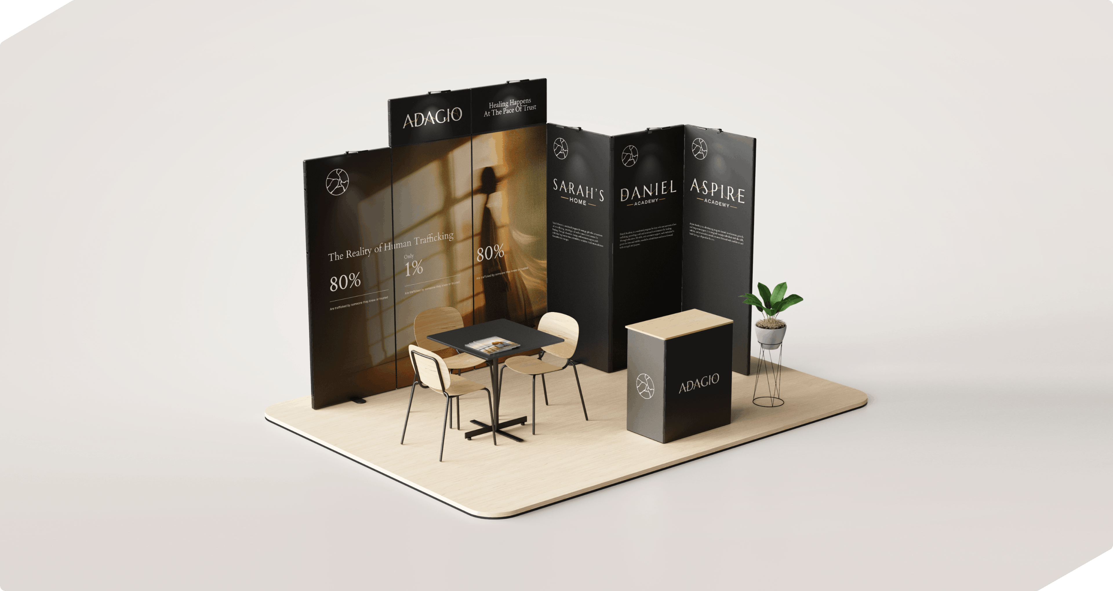
Working closely with the client, we developed the Adagio name, mission, brand story, and wider identity from the ground up. We also created a comprehensive brand guide and the supporting collateral needed to launch the new brand, helping both existing audiences and internal teams understand the reasoning.

This was a unique project because we weren’t simply creating a new brand—we were also consulting on a fundamental change to the organization’s structure. Introducing a parent brand above the individual programs created a clearer hierarchy, reduced confusion, and gave Adagio a scalable foundation for future growth. It was the right strategic solution for where the organization was headed.

This project has won:

Before
After

The big problem

Restructuring a rapid growing non-profit

Even while we were working with the client, a new program was already being developed, bringing the organization to four distinct brands by launch, with further growth expected. That rapid expansion made it clear that creating a parent organization would deliver the greatest long-term value: reducing confusion, creating a clearer structure, and giving the organization room to continue growing.

The early stages of the project focused heavily on consultation and strategy, including the development of the new parent brand name, Adagio. Inspired by the idea of moving at a calm, considered pace, the name became closely tied to the concept of “the pace of healing.”

Design with meaning

The art of Kintsugi

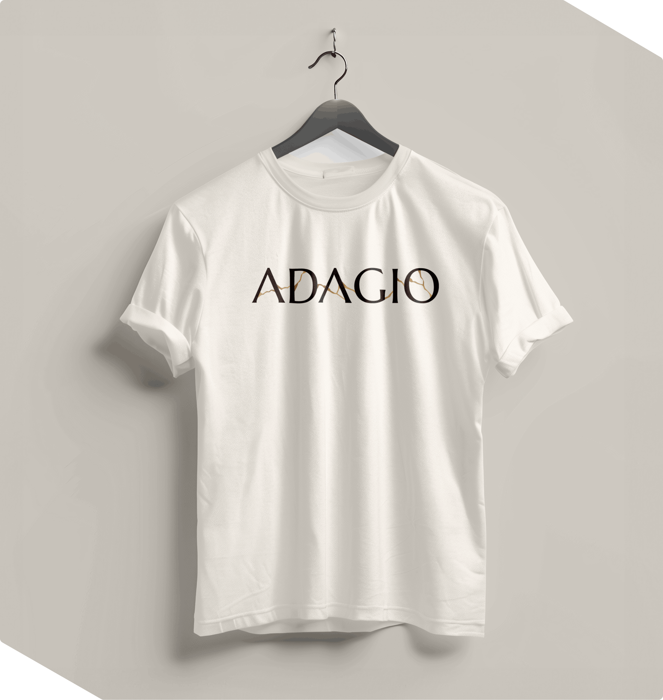
With the name, strategy, and mission established, it was time to bring the Adagio brand to life visually. Rather than interpreting the idea of time or pace too literally, we found inspiration in Kintsugi, the Japanese art of repairing broken pottery with gold, celebrating its history rather than hiding it.

The philosophy connected naturally with Adagio’s focus on healing, resilience, and moving forward. From this concept, we developed the Adagio logo, a complementary identity system for each of its programs, and a comprehensive brand guide that would shape everything from the website to future marketing materials.

Launching the brand

Translating into UI/UX

With the brand approved, the next step was translating the new identity into a complete digital experience. The plan was to retire the existing Sarah’s Home website and launch Adagio as the new parent organization.

A major focus of this phase was user journey and information architecture, making it immediately clear that Adagio sits above a number of distinct programs, each serving a specific purpose. Once that structure was defined, we designed the full website experience before developing it into a custom, flexible platform that would be easy for the Adagio team to manage.

Client Testimonial

5 star digital marketing agency
Jillian Winters, Community Engagement Coordinator

What's next?